
Fact-checking of misleading visuals
Fact-checking is hot. Platforms for fact-checking and Twitter accounts that fight fake news and misleading information are popping up everywhere. But most of this fact-checking skips an important source of misinformation: visuals.
Researchers of the Science Communication & Society department of Leiden University want to make a change.
“Written news has been studied a lot already, but research focusing on visual news remains behind,” says postdoctoral researcher Winnifried Wijnker, “even though visual communication is growing rapidly.” She surveys misleading types of images and studies the best way to handle misleading graphs together with an interdisciplinary team consisting of journalists, a mathematician and a statistician.
Graph Literacy
“Visuals tell much more than text, but that makes deception harder to spot. There are simply more matters to pay attention to,” states Wijnker. The power of the directness of visuals makes this even more difficult. “The direction of the line is the first thing you notice when you look at line graphs, that’s your initial perception. When you see a large increase for example, then that image is stuck in your head and you make your own conclusions. Afterwards, it is difficult to change that image in your head when you read the axes and find out that the graph is not entirely accurate.” Knowledge about the construction of graphs can help. “People’s graph literacy has improved because of the pandemic,” laughs Wijnker. “Last year, graphs were all over the news.”
In her research, Wijnker wants to find the best way to correct deception. Some methods are to show the source of the error in the graph itself, to give a description of the mistake, or to only show the correct graph. “Earlier research investigating text in social media demonstrated that it doesn’t work to repeat the wrong message in order to correct it afterwards. That only amplifies the error. By immediately stating that something’s wrong, you avoid making it worse. Maybe it works similarly for visual deception.”
Misleading politicians?
Master student Josine Meijer confirms that fact-checking text is easier than fact-checking graphs. She studies the number of misleading graphs shared by Dutch politicians on Twitter during the elections. A common case of misleading graphs is a missing baseline, but new variants come into existence because of digitization. Meijer gives an example: “If a graph is very little or of a bad quality, making it unreadable, it can also deceive you.”
A graph shared by Dutch party D66, can you spot the deception?Meijer did not yet go through all the data but she has already spotted some interesting trends. For example, GroenLinks shared by far the most graphs on Twitter and fortunately, the number of misleading graphs shared by politicians is small. Most of the deceptive graphs don’t display data in a wrong manner, but rather play on emotions. “It’s a different case for Forum voor Democratie,” says Meijer, “they share a lot of graphs that are taken out of context. They use graphs for another purpose than the original aim of the research or create an incomplete image by not sharing all data.”
Unfortunately for the communication student, Forum voor Democratie shares their graphs only on their website and not on Twitter: “I can’t use them in my research.”
Do it yourself
One of the objectives of the visual deception study is to draft guidelines for fact-checkers so they can check visuals as well. But how can you find out if you’re being deceived? Wijnker and Meijer already mentioned different forms of deception. As mentioned earlier, you can keep an eye on graphs of bad quality, missing baselines and graphs that play on emotions.
“A more subtle mode of deception is the use of color. Some colors draw more attention, which gives the feeling that there is more contrast than there actually is,” explains Wijnker. “There are also graphs that are correct on their own, but are misleading in the context,” adds Meijer. This last category is hard to check. And this is one of the reasons why specific guidelines to analyze images and graphs for fact-checking do not yet exist. The Science Communication & Society team hopes to offer the guidelines to future fact-checkers after the study has been conducted. But for now, Meijer recommends the book How Charts Lie by Alberto Cairo to everyone whose interest is sparked and who wants to be able to spot other forms of deception.
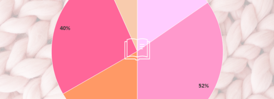
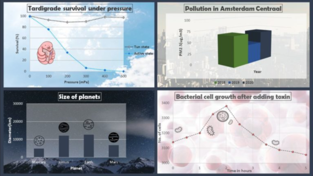
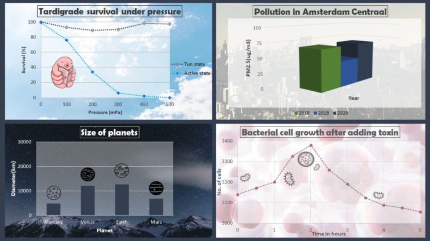
Curious how well you can spot visual deception? Test yourself by determining which of the graphs below are deceptive. The answer is given under the graphs.


0 Comments
Add a comment